This post is going live on the last day of summer, 2019. September 23 is the first day of fall and the first day of Climate Week in New York City. To that end, I wanted to share a climate-related art project that appeared on my to-do list about 9 months ago.
First, let me start out by saying that I am not a winter person, or a fall person. I hate being cold, and the only things that get me through the winter months with some semblance of sanity are snow sports and indoor projects, such as knitting.
Second, you should know that I am the queen of structured procrastination:[1] when I should be doing something for work, I clean; when I should be cleaning, I exercise; when I should be exercising, I start (or plan) a new project, such as this one, which began when I was visiting friends in blissfully warm California this past January.
A New Way of Sharing Data
I was up very early (as happens only when I visit the west coast), scrolling through internet articles when I saw a story about a “climate change scarf” presented at a conference. In 2015, Dr. Joan Sheldon, a marine scientist from the University of Georgia, displayed a scarf that she had made, which showed bands of color representing temperature variations in the global climate from 1600 AD to present day. She said that holding the scarf “approaches you in a different way” than simply viewing a climate graph. Even scientists familiar with the data seemed entranced by the scarf when they first saw it: many wanted to touch it and find the year they were born.[2]
News about the scarf spread, and craft shops began to pop up where you could order your own scarf kit based on temperature data from one year in a location of your choosing.[3] There are knitting sites that will provide a basic pattern and link to the data set where you can pull information yourself and knit based on what you find.[4] For non-crafty types, you can purchase a growing number of items with visual climate data already printed on it and ready to go: clothing, coffee mugs, and even a car.[5]
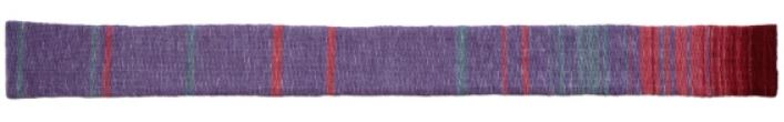
Image credit: Wade Sheldon
Trends in Global Temperatures
Whatever you may personally believe about the causes of climate change, even the staunchest of conservatives are beginning to agree that we are experiencing more extreme temperatures and weather events. Eight of the hottest years on record have happened in the last decade; the 10 hottest have all happened in the last 15 years.[6]
Before I saw Dr. Sheldon’s scarf, one of the most striking images I had encountered was created by XKCD artist Randall Munroe. This well-researched graph pulls data from various sources including glacier core samples, which allow scientists to estimate global temperature averages back to about 20,000 BC. Scrolling through the graph, you see periods of global warming and cooling marked with historical milestones such as the cave paintings in Lascaux (15,800 BC), the arrival of humans in South America (11,000 BC), the domestication of horses (4,000 BC) and the Little Ice Age in Europe (1650 AD).
The average global temperature does progress through warming and cooling periods, fluctuating through a range of about five degrees Celsius (or nine degrees Fahrenheit) from 20,000 BC to the 20th century. Even the most dramatic shifts take place very slowly, one period showing a 2° C (3.5° F) increase over 3000 years. Continue scrolling down this graph, to modern day, and the gentle undulations take a sharp turn at the late 20th century. When this chart was made in 2016, the global average showed a 1° C (1.8° F) increase in the past 100 years alone. The predictions at the time estimated an additional increase of 3 degrees C by the end of this century if we continued down our current path with no behavior change. [7]
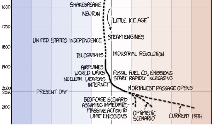
Image credit: XKCD
My Scarf
The scarf created by Dr. Sheldon was beautiful, fascinating, and (to me) scary. I wanted to knit something like hers dating back to the middle ages, but I ran into difficulty looking at the different sources of information. There are several projections of reconstructed temperatures based on tree rings, coral growth, ice cores, lake sediments, and fossils, to name a few. Since these are scientific projections based on different data, they don’t always agree with each other. Over long periods of time, you can overlay them and smooth them out to observe trends (like in the XKCD graph), but I wanted the level of granularity we have with climate data from the last century. (Also, not being a climate scientist myself and not really knowing what I was looking at, I didn’t want to run the risk of influencing my pattern with any biases I might have.)
The National Oceanic and Atmospheric Administration (NOAA), has been tracking temperature information since the 1850s, with information robust enough to calculate global averages beginning in January 1880. Since there is no way to get that kind of granular data from before NOAA started recording temperatures, I decided to make my scarf pattern a breakdown of temperatures since 1880. Digging in deeper, I found that it is actually quite difficult to calculate global temperature averages, even with all of the equipment and monitoring we have today. The best suggested course of action I could find in making this scarf was not to use temperature averages, but temperature anomalies.
Temperature anomalies are departures from a reference value or a long-term average. The XKCD graph uses the average global temperatures from the 30 year period of 1960 to 1990 because those years were relatively stable and can therefore be used as a point of comparison. On the XLCD graph, the middle line, or “zero point,” on that scale represents the average from the middle of the twentieth century. NOAA has a calculated, downloadable set of global temperature anomalies, and each data point, rather than being a temperature, is the difference between the actual temperature recorded and that mid-20th-century “reference value.” In this set, negative values represent below-average temperatures; positive values, above-average temperatures.[8]
I am fairly sure that when I downloaded my data set back in January, NOAA was using that same thirty-year average mentioned above as its reference point. Their site now states that they use the average from the entire twentieth century as their reference point, which I would imagine shifts the reference temperature up slightly, given the sharp warming that was beginning to take place in the 1990s. As a result, I will no longer be able to simply add data to the end of the scarf as I go – the information you can download now is no longer the same as what I downloaded in January.
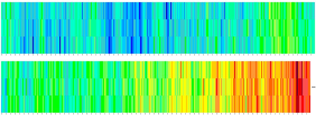
Just because I like to make things more difficult than they need to be, I decided to create a pattern showing monthly, not annual data. I knew this choice would make the scarf more complex, but also more visually interesting. I put the 1668 points of data into Excel (139 years times 12 months), dividing it up so there were three months represented on each row, four rows making up one year. I used conditional formatting in Excel to show what it might look like, with each color representing a 10-degree Fahrenheit range.
Who knows if I will ever get around to making this scarf, but it’s there as an option. If you would like to make it, you can download the pattern below. If you do, please let me know!
Have you ever encountered a piece of art that helped convey an idea to you in a way you hadn’t considered before? I’d love to hear about it below.
Thanks for reading!
[1] https://www.npr.org/2012/12/25/168035622/perfectionists-are-often-the-best-at-the-art-of-procrastination
[2] https://www.fastcompany.com/90290800/crafting-take-a-dark-turn-in-the-age-of-climate-crisis
[3] https://www.tempestryproject.com/
[4] https://www.ravelry.com/patterns/library/min-max-climate-change-scarf
[5] https://www.vox.com/2019/3/4/18246245/climate-change-warming-stripes
[6] https://en.wikipedia.org/wiki/Instrumental_temperature_record
[8] https://www.ncdc.noaa.gov/monitoring-references/faq/anomalies.php#anomalies
0 Comments